Customer Segmentation & Business Insights — Mall Customer Segmentation Dashboard
Targeted marketing and customer understanding are crucial drivers of business growth. To unlock these insights, I designed and developed the Mall Customer Segmentation Dashboard, an interactive, premium analytics web application built with Streamlit and Plotly. The application allows business analysts to explore, profile, and target customer segments on the fly using unsupervised machine learning. In addition, it implements a unique hybrid pipeline integrating a supervised proxy classifier to solve real-world clustering challenges, such as handling out-of-sample data points for algorithms that don't natively support them.
🚀 Key Features
- Multi-Algorithm Control Panel: Swap dynamically between K-Means, DBSCAN, and Hierarchical Clustering. Fine-tune hyperparameters on the fly (number of clusters $K$, linkage criteria, Epsilon radius, and minimum samples) and observe clusters update in real-time.
- Supervised KNN Predictor Wrapper: Models like DBSCAN and Agglomerative Clustering do not natively support predicting clusters for new, unseen data points (out-of-sample). I implemented a 3-Nearest Neighbors classifier trained dynamically on active cluster labels to enable real-time predictions for all selected clustering models.
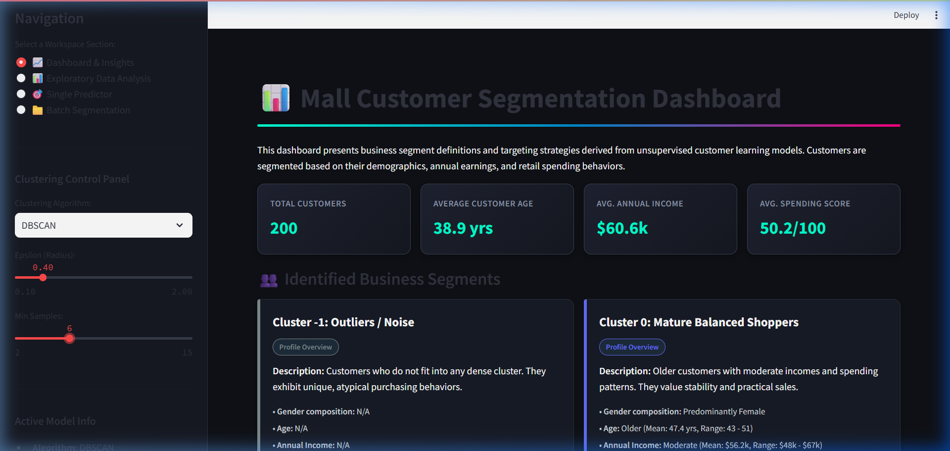
- Dynamic Rule-Based Segment Profiling: Demographics and cluster centroids are processed dynamically to identify and auto-label customer segments (e.g., Affluent Spenders, Frugal Shoppers, Balanced Cohorts) and generate tailored, actionable business marketing strategies. Outliers (DBSCAN Cluster
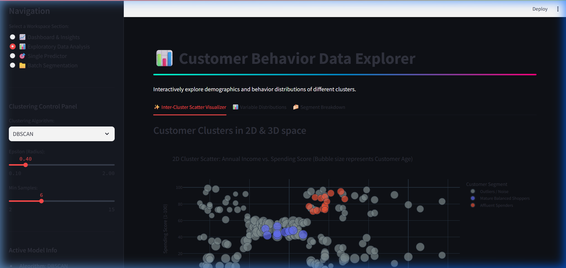
-1) are captured and labeled as noise for distinct handling. - Interactive EDA Visualizations: Compare features in 2D & 3D Scatter Plots, examine demographic distributions, and view segment breakdowns using interactive charts powered by Plotly.
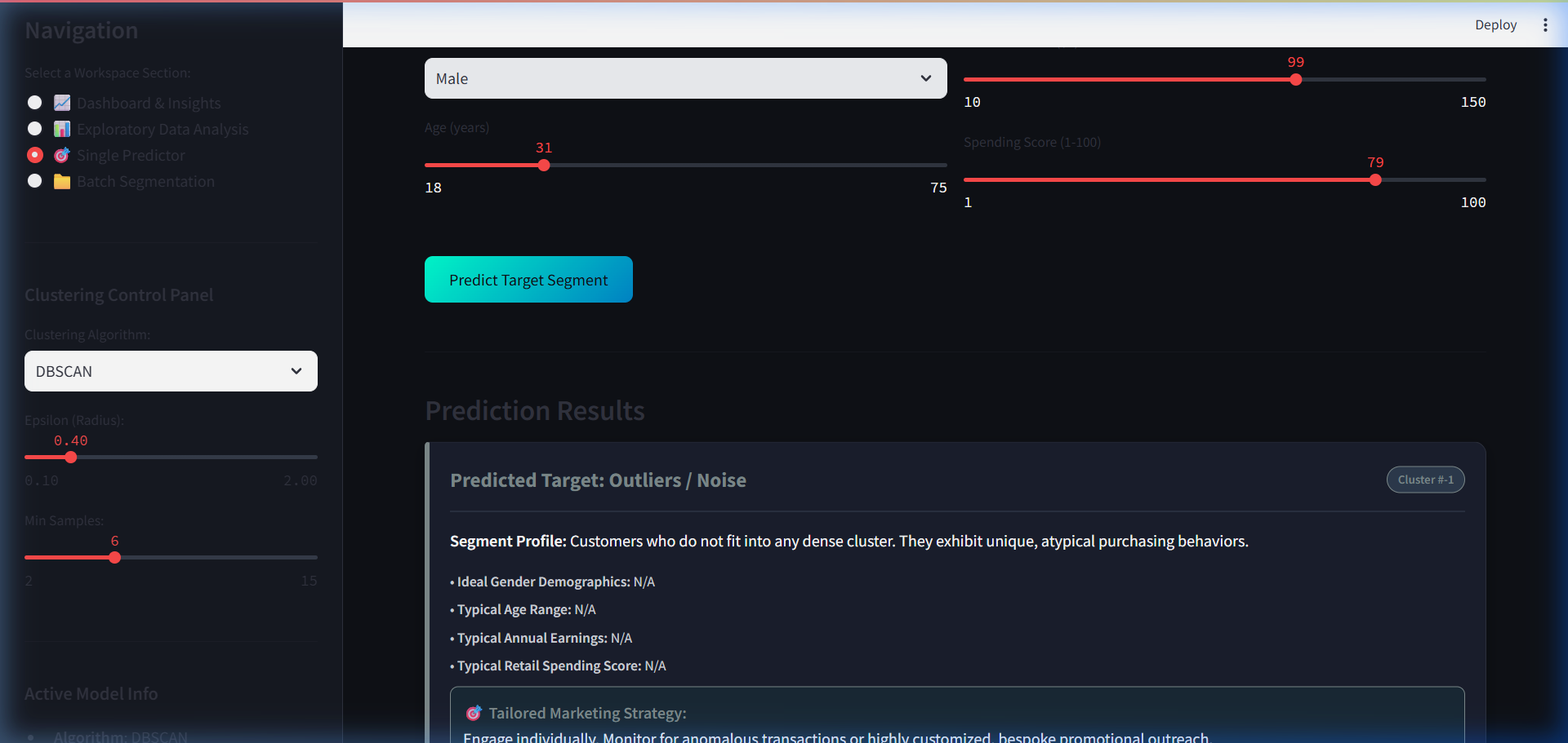
- Single Predictor Tool: Enter demographics (Gender, Age, Income, Spending Score) to instantly categorize a new customer and compare their profile against segment averages using interactive gauge charts.
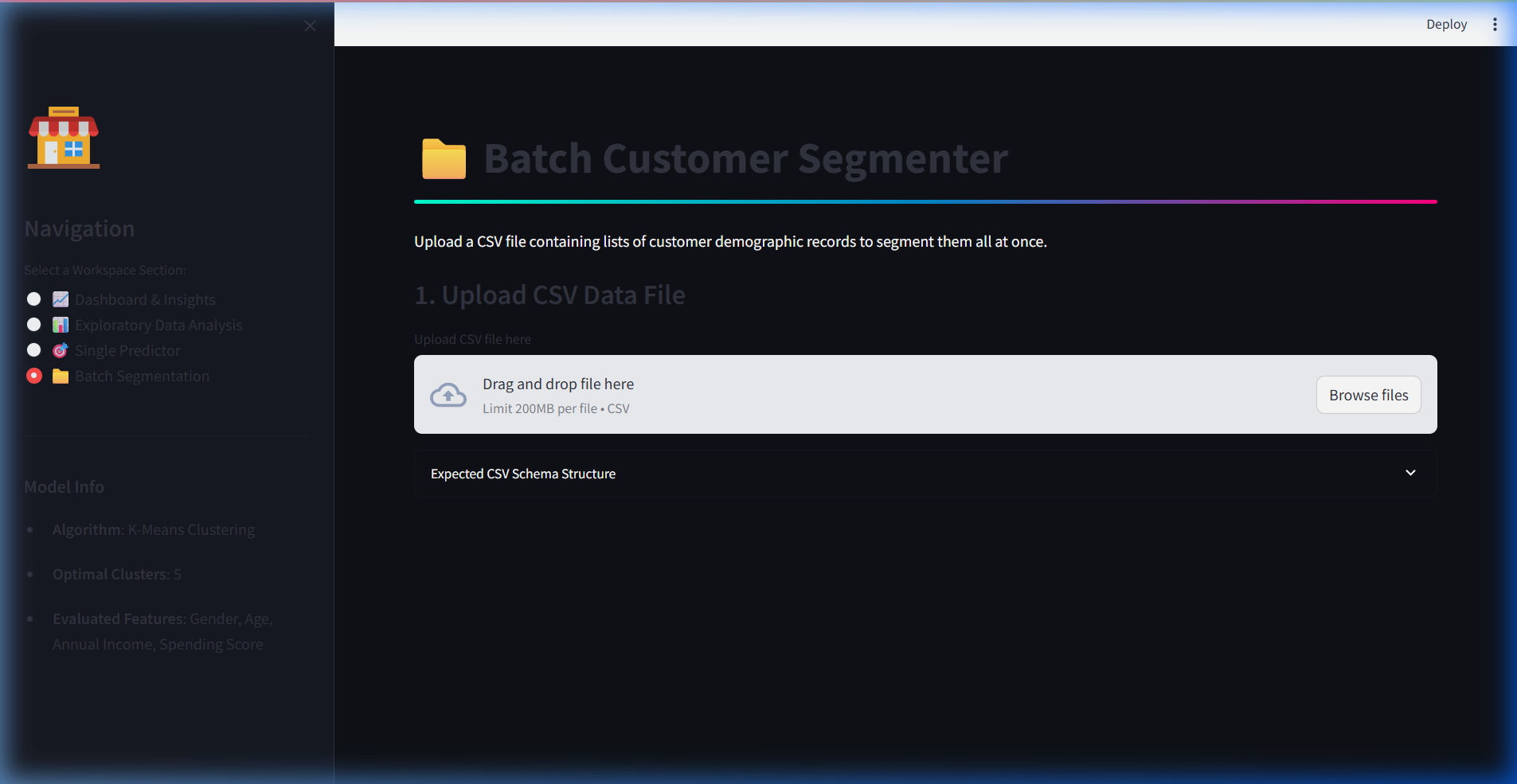
- Batch Segmentation: Upload a CSV list of customer records, perform cohort predictions in bulk, inspect the results, and download the categorized spreadsheet instantly.
🛠️ Technology Stack
- Front-End & Dashboard: Streamlit
- Data Manipulation: Pandas, NumPy
- Machine Learning: Scikit-Learn (
KMeans,DBSCAN,AgglomerativeClustering,KNeighborsClassifier,StandardScaler) - Data Visualization: Plotly Express & Plotly Graph Objects
- Pipeline Preservation: Pickle (serialized scaler and models)
🧠 Deep Dive: The Supervised KNN Wrapper
A core challenge in unsupervised learning is deploying models. While K-Means projects centroids that make it easy to find the closest cluster for a new data point, algorithms like DBSCAN (density-based) and Hierarchical/Agglomerative (connectivity-based) do not define mathematical centroids or projection matrices for predicting new points.
To resolve this, the pipeline wraps the clustering outputs with a supervised K-Nearest Neighbors (KNN) classifier. Whenever the user adjusts clustering settings, the application fits the clustering model, extracts the labels, and dynamically trains a 3-NN classifier using the scaled demographics as features and the cluster assignments as targets. When a new customer profile is input, the KNN wrapper acts as a proxy, identifying the most appropriate cluster assignment instantly.
🌐 Dashboard Workspaces & Preview
1. 📈 Dashboard & Insights
Displays overall database metrics and lists details for each segment discovered, including population size, averages, and tailored business strategies.
2. 📊 Exploratory Data Analysis
Visualizes variables in 2D or 3D scatter plots with point bubble sizes representing age, variable distributions, and pie/bar chart representation of cohort market share.
3. 🎯 Single Predictor
Allows entry of a new customer's age, gender, annual income, and spending score. It scales the features, runs them through the KNN wrapper, and displays comparative gauge charts.
4. 📁 Batch Segmentation
Enables bulk uploads of CSV data, segments cohorts instantly, displays overall breakdown distributions, and lets you download the results as a new CSV.
🧪 Try It Live & View Code
Click here to launch the live Streamlit Dashboard
View the complete codebase on GitHub
🔗 Connect with Me
🌐 www.tauqueeralam.com
📱 LinkedIn | GitHub
View the live demo below:
View Live Demo
Discussion