NCR Pollution Intelligence: AI-Powered Pollution Source Identification and Forecasting
Air pollution in Delhi-NCR is not caused by one constant factor. Traffic, construction dust, industrial combustion, agricultural fires, weather, and chemical reactions in the atmosphere can all contribute to poor air quality. NCR Pollution Intelligence is an AI-powered command center designed to understand those changing conditions, identify likely pollution sources, and forecast what the air may look like over the next 24 hours.
The system combines live weather and pollutant observations, historical time-series data, satellite fire information, hyperlocal calibration, machine-learning models, and explainable visualizations. This makes it more than a sensor reader: it is a spatially aware intelligence system for studying how, why, and when pollution changes across the region.
Project Objective
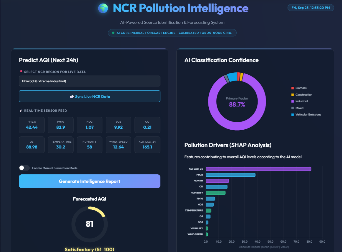
The central objective is to convert complex environmental data into a clear operational answer. For a selected station in the NCR region, the system estimates the current Air Quality Index, forecasts the next 24 hours, and explains the most probable reason for the observed pollution.
Instead of presenting raw API responses or isolated numbers, the dashboard answers three practical questions:
- How polluted is the air right now?
- How could air quality change during the next day?
- Which source category best explains the chemical fingerprint?
Real-Time Data Ingestion Layer
When a user selects an NCR station and clicks Sync Live Data, the backend starts three complementary data pipelines. These pipelines give the system awareness of both the atmosphere above the station and important events occurring on the ground around it.
1. OpenWeather Pollution and Weather Data
The application first resolves the selected station's geographical coordinates and requests live environmental measurements from the OpenWeather API. The incoming pollution data includes PM2.5, PM10, nitrogen dioxide (NO2), sulfur dioxide (SO2), carbon monoxide (CO), and ozone (O3).
Alongside pollutant concentrations, the system records temperature, humidity, and wind speed. These weather variables matter because they influence dispersion, accumulation, chemical reactions, and the movement of particulate matter.
2. Historical Pollution Timeline
A current reading alone cannot describe the direction of a pollution event. The historical pipeline looks approximately 72 hours into the past and builds a sequential timeline for the selected location. This three-day window allows the forecasting engine to learn recent spikes, daily cycles, persistent episodes, and the relationship between pollution and changing weather.
3. NASA FIRMS Satellite Fire Data
The system also connects to the NASA FIRMS feed for SUOMI NPP VIIRS C2 thermal-anomaly observations. These satellite observations help reveal active farm fires and industrial heat events that may influence regional air quality.
To make the satellite data relevant to the selected station, the backend calculates the distance between the station and each thermal anomaly using the Haversine formula. It then counts fire or heat events within a precise 50-kilometre radius. This produces a local fire-activity signal that can be used by the prediction and source-identification models.
Hyperlocal Calibration Engine
Delhi-NCR is a connected region, but every station has a different environmental profile. A traffic-heavy crossing does not have the same pollution signature as an industrial area or a location closer to agricultural activity.
To account for these differences, the backend uses a scientifically informed STATION_PROFILES dictionary. Each profile applies location-specific mathematical multipliers to the incoming measurements. For example, Bhiwadi can receive stronger PM10 and SO2 calibration because of its industrial character, while Anand Vihar can receive stronger NO2 calibration because it is a major traffic choke point.
This calibration layer prevents the model from treating the entire NCR as one uniform city. It gives the forecasting pipeline a more realistic local context while keeping the data-ingestion architecture reusable for additional stations.
Hybrid Machine-Learning Pipeline
The system uses multiple models because forecasting and source identification are related but different tasks. A time-series model is best suited to predicting future AQI, a regression fallback keeps the dashboard available when history is incomplete, and a classification model translates pollutant relationships into actionable source categories.
Primary Forecasting Engine: LSTM
The primary forecasting model is a Long Short-Term Memory (LSTM) neural network. LSTMs are designed for sequential data because they can retain useful information from earlier time steps while learning which patterns should be forgotten.
The model receives a three-dimensional sequence containing approximately 72 hours of history across 9 environmental features. By studying recent rises and falls in pollution alongside temperature, humidity, wind, and related observations, it estimates the current AQI and forecasts the following 24 hours.
This approach is useful for air quality because pollution has momentum. A stagnant atmosphere can allow pollutants to accumulate, while stronger wind or a change in humidity can alter the next stage of the event. The LSTM attempts to learn those temporal relationships rather than relying only on one instantaneous reading.
Fallback Model: Gradient Boosting Regressor
Live systems must remain useful even when an external service returns incomplete history. If the required 72-hour sequence is unavailable or fails quality checks, the application switches to a Gradient Boosting Regressor (GBR).
The fallback uses engineered features such as the AQI from 24 hours earlier, current environmental readings, and satellite fire radiative power (FRP). Gradient boosting combines many smaller decision-tree models to produce a fast regression estimate. It gives the interface a dependable baseline and also supplies the feature contributions used in the dashboard's SHAP-based explanation.
Source Identification: XGBoost Classification
The source-identification engine uses an XGBoost-style classification approach to organize the likely cause of pollution into five categories. Its decision process examines chemical fingerprints rather than relying on a single pollutant.
- Vehicular emissions: A strong NO2 signal, particularly above approximately 25 µg/m³, combined with an elevated PM2.5-to-PM10 ratio above 0.45, suggests traffic exhaust and fine particulate emissions from vehicles.
- Biomass or stubble burning: A very high PM2.5-to-PM10 ratio above 0.70 indicates a large amount of microscopic smoke particles, which is consistent with raw biomass combustion and heavy smoke.
- Industrial or coal burning: A sharp increase in the SO2-to-NO2 ratio above 0.25 points toward sulfur-rich fossil-fuel combustion in factories, boilers, or power-generation environments.
- Construction or dust: A low PM2.5-to-PM10 ratio below 0.38 indicates that heavier mechanically generated dust makes up most of the airborne mass.
- Mixed or secondary pollutants: When there is no extreme outlier and ratios remain balanced around 0.40 to 0.60, the system classifies the event as mixed background pollution or urban smog formed through atmospheric reactions.
These thresholds are interpretable: they let a presenter explain not only the model's label, but also the pollutant relationship that contributed to it.
Dashboard and Intelligence Output
The frontend turns the pipeline into an operations dashboard so that users can understand the result without reading raw JSON, model logs, or API responses.
- Dynamic probability bars: The dashboard displays the model's confidence across the five source categories, such as 70% biomass, 10% traffic, and the remaining probability distributed among other causes.
- Current AQI and 24-hour forecast: Users can view the latest estimate and the projected trend in one place.
- Actionable health advice: Safety guidance changes with the calculated AQI severity, helping users understand what the number means in practice.
- Explainable AI chart: SHAP analysis reveals how factors such as humidity, wind, fire activity, and pollutant measurements influenced the prediction.
- Prediction history database: SQLite records model inferences so that previous predictions can be reviewed, compared, and studied over time.
- PDF export: Native canvas-based export converts the dashboard into a standalone report suitable for a classroom presentation or an environmental briefing.
- Intelligence feed: A live status area reports model loading, API connectivity, and satellite synchronization progress.
- Responsive operation: The command center adapts to smartphones and tablets so it can support field-level monitoring as well as desktop analysis.
End-to-End System Flow
- The user selects an NCR monitoring station.
- The application synchronizes current weather, pollutant, historical, and satellite data.
- The backend validates the incoming values and applies the selected station's calibration profile.
- The LSTM forecasts the current and next 24 hours when the full historical sequence is available.
- The GBR provides a fallback estimate when the historical input is incomplete.
- The source-identification model evaluates pollutant ratios and environmental signals.
- The dashboard presents AQI, forecast, source probabilities, health advice, feature explanations, and synchronization status.
- The inference is recorded in SQLite and can be exported as a PDF report.
How to Present the Project
For a college presentation, begin with the interface and show the live synchronization control. Explain that one action starts weather, historical, and satellite requests in parallel. Then move to the primary AQI forecast and describe how the LSTM learns from the previous 72 hours.
Next, focus on the source-classification probabilities. Use the PM2.5-to-PM10 and SO2-to-NO2 relationships to explain how the system maps a chemical footprint to traffic, smoke, industry, construction dust, or mixed pollution. Finish by exporting the PDF and showing the prediction history to demonstrate that the application is not only visual, but also persistent, explainable, and auditable.
Try It Live and View the Source Code
Open the NCR Pollution Intelligence live demo on Hugging Face to explore the dashboard and its forecasting workflow.
View the complete project source code on GitHub.
Connect with Me
www.tauqueeralam.com
LinkedIn | GitHub
Discussion